Hound
Defining who we are and what our brand stands for.
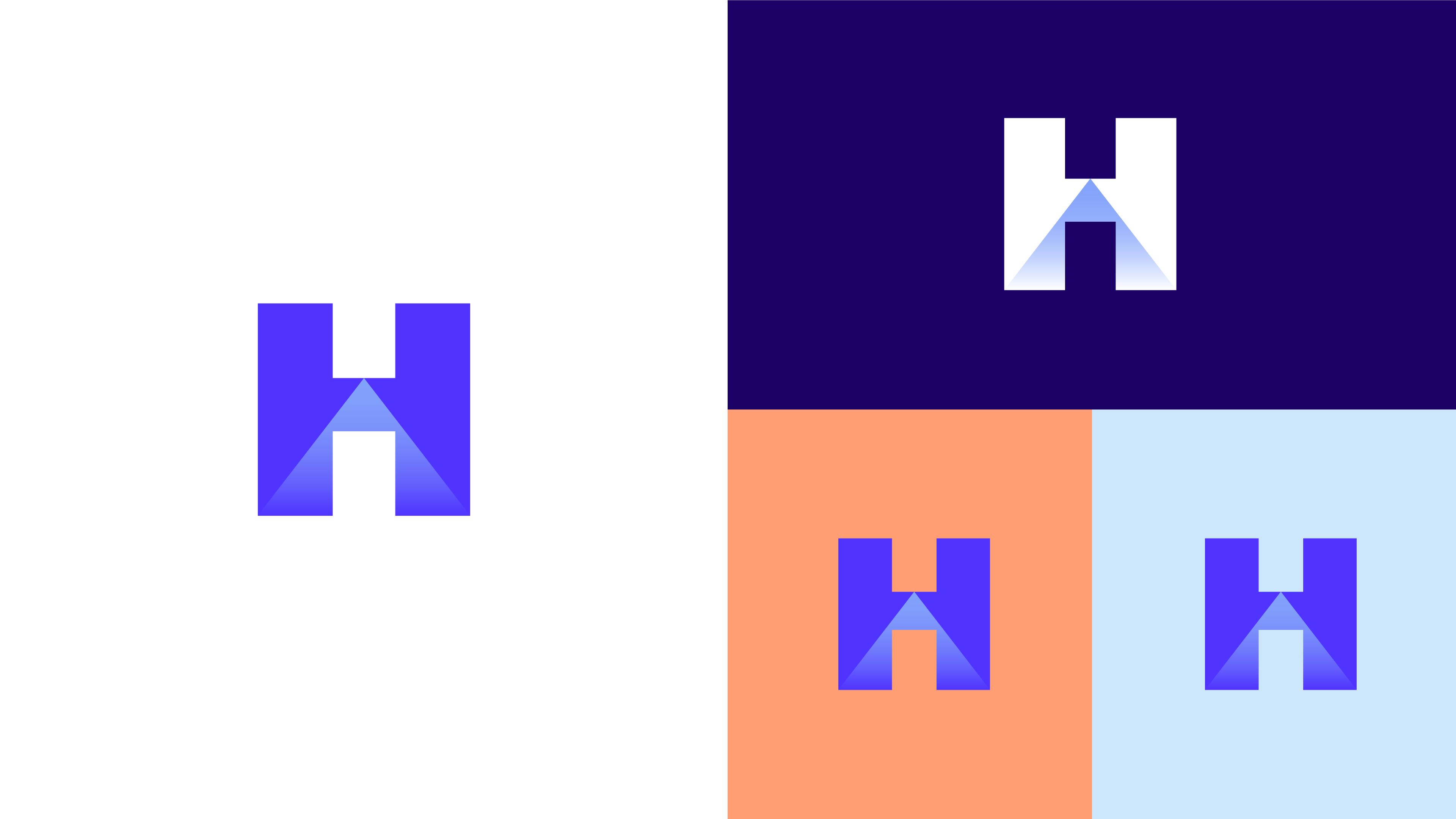
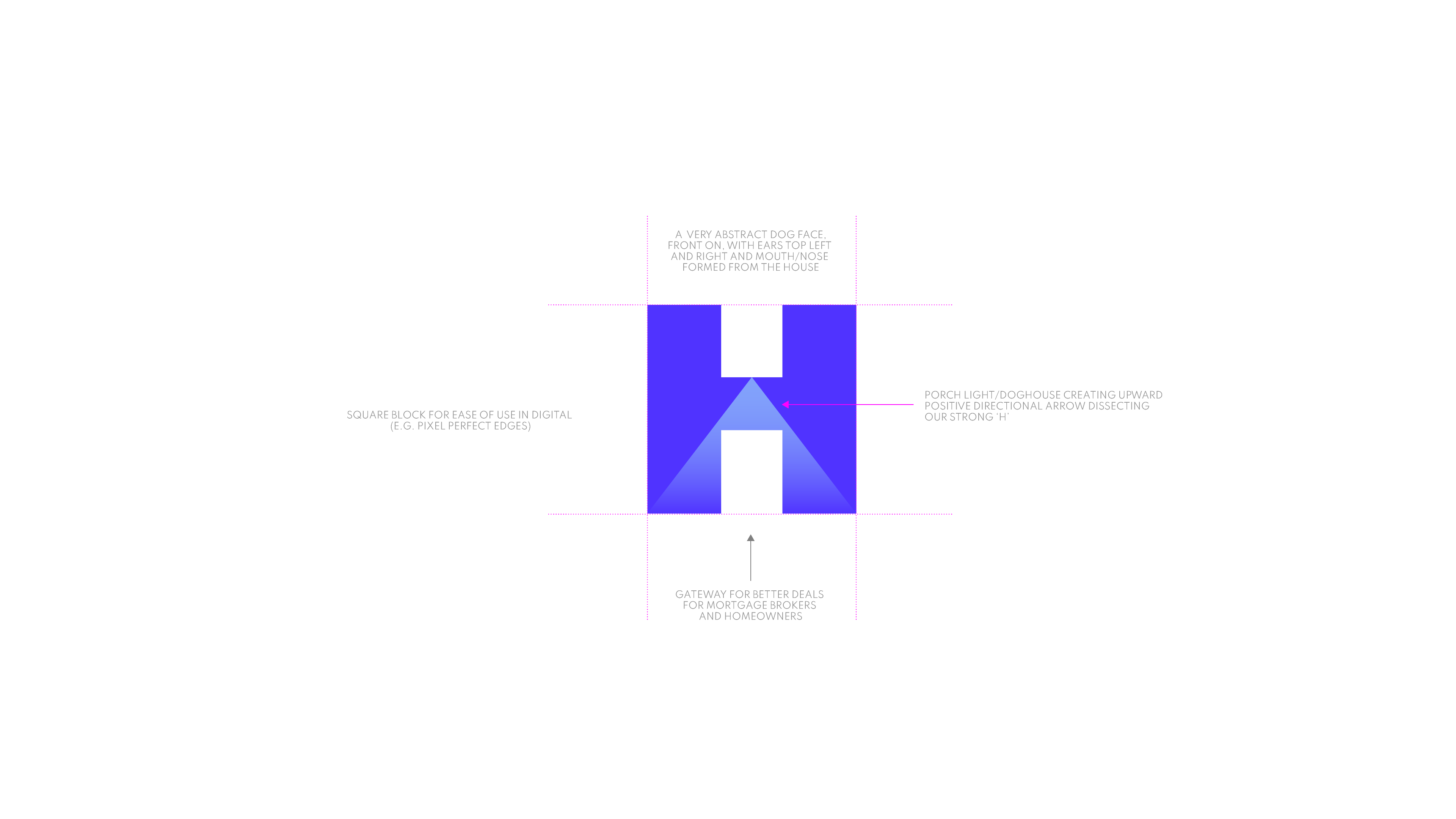
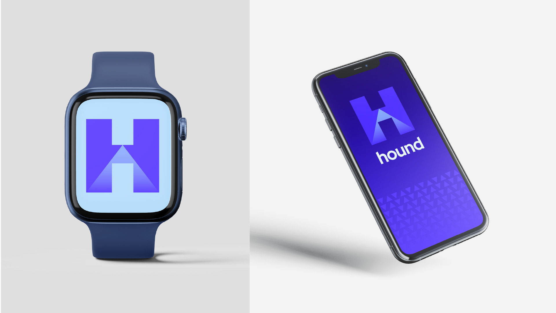
Bold, confident and simple. A mark that can act as a stamp of endorsement; an icon that captures brand as well as our offering.
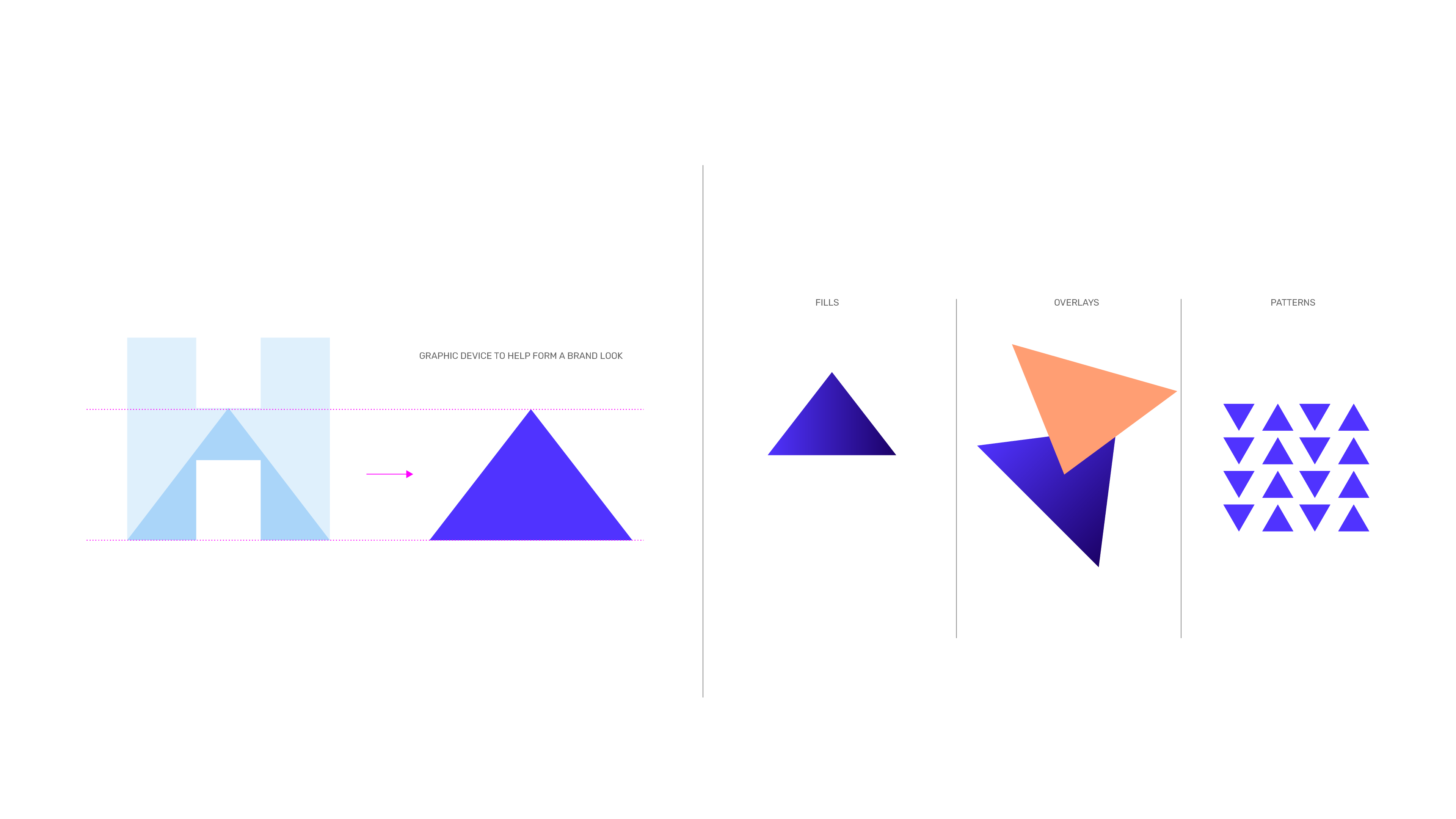
It’s versatility is shown in its use of gradient, as well as flat colours when preferred or needed. The strong arrow triangle provides positive direction and a useful element for further brand look and feel exploration in the future.
We have created a visual identity which is confident in its presentation, yet engaging from a customer point of view. The identity and visual system are flexible in order to adapt to various environments whilst being considerate to common budget and delivery constraints.
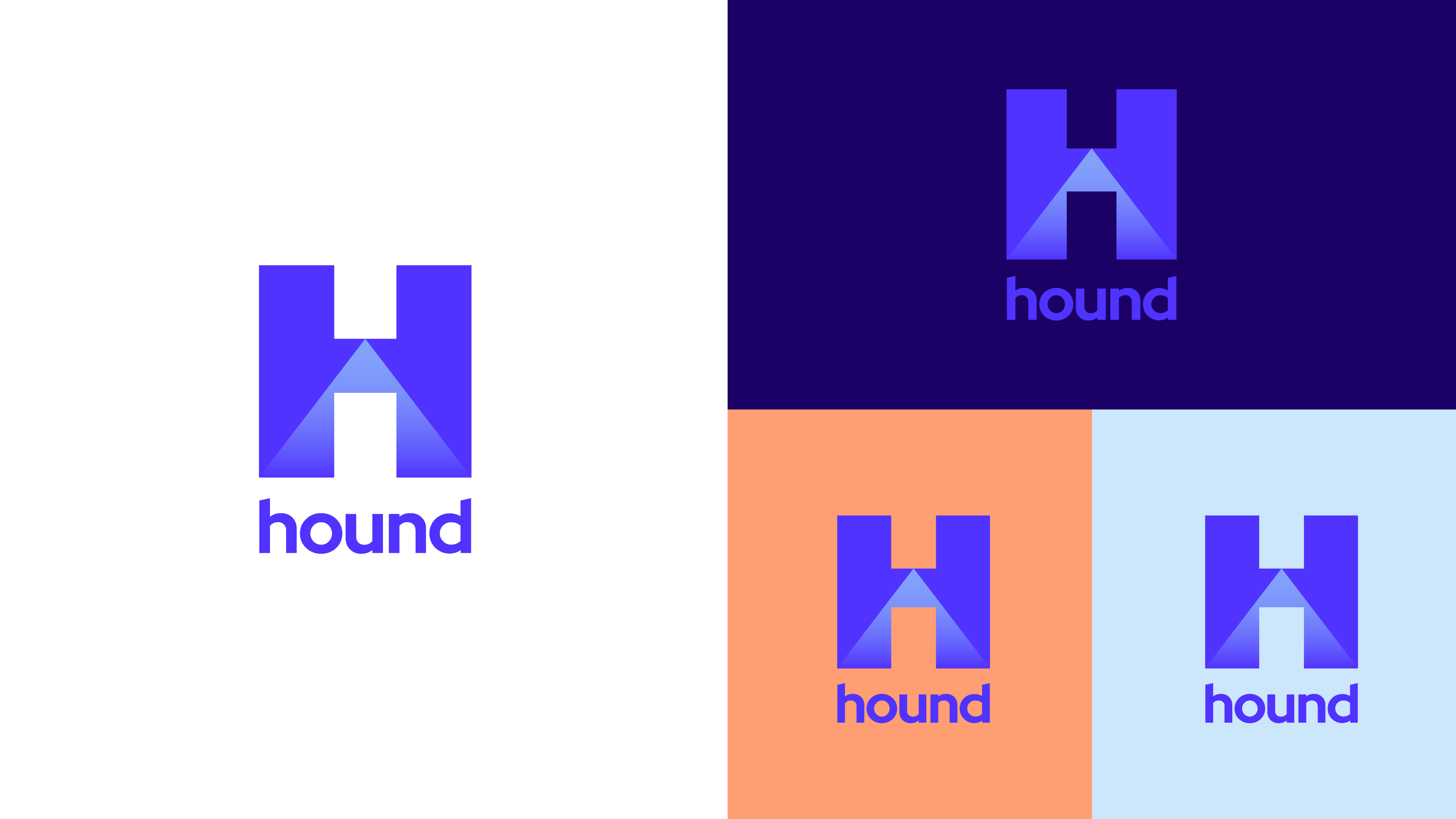
Positive version of the stacked logo shown, to be used on light backgrounds or where enough contrast exists for very dark background.
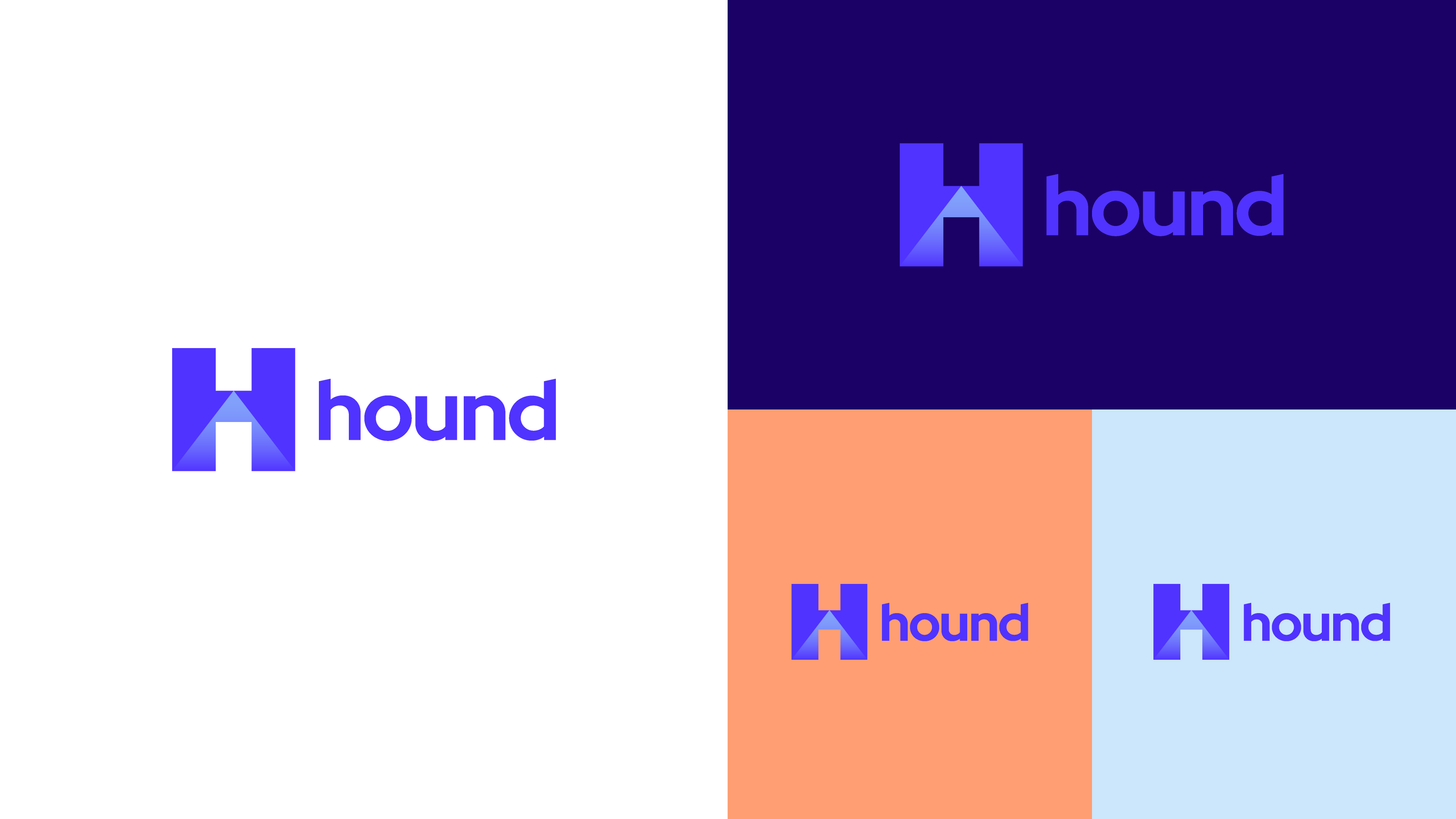
Positive version of the horizontal logo shown, to be used on light backgrounds or where enough contrast exists for very dark background.
![]()
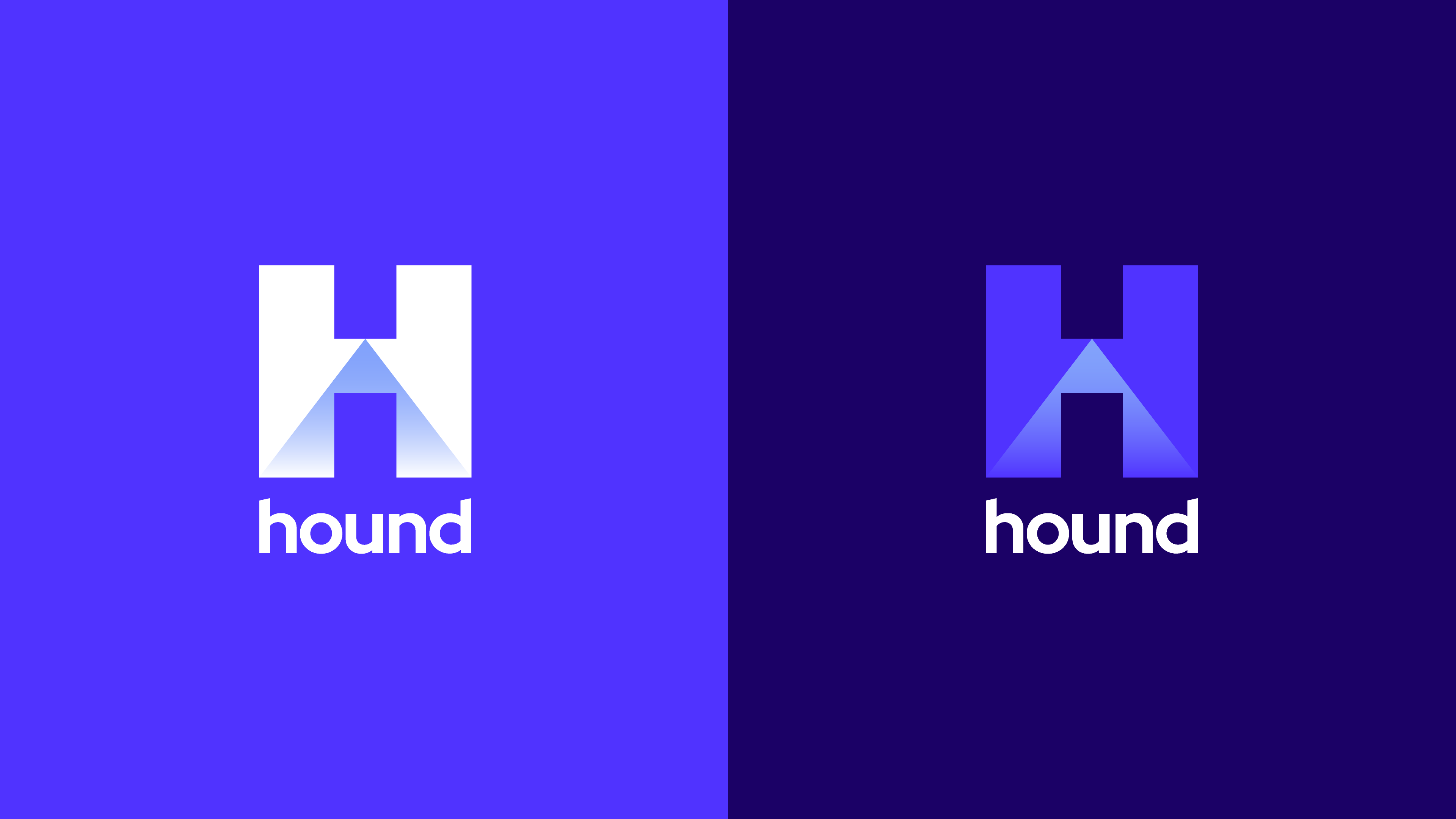
The left shows a fully negative version, where legibility of the logo dictates its use. The right is the preference (‘mixed’), when style and legibility allows. The horizontal, the stacked and the icon versions all come in these colourways.

Colour Palette
Click the coloured box to copy the hex code (#) to your clipboard
- Click the coloured box to copy the hex code to your clipboard
Neon Blue
PMS: 2726
CMYK: 84-70-0-0
RGB: 80-51-255
#5033ff
Misty Blue
PMS: 2716
CMYK: 42-27-0-0
RGB: 130-162-251
#82a2fb
Navy
PMS: 2765
CMYK: 100-98-0-45
RGB: 27-1-102
#1b0166
Peach
PMS: 1635
CMYK: 0-47-50-0
RGB: 255-158-115
#ff9e73
Sky Blue
PMS: 657
CMYK: 23-6-0-0
RGB: 170-213-249
#aad5f9
Light Blue
PMS: 656
CMYK: 10-2-0-0
RGB: 223-240-252
#dff0fc
Gradient #1
Neon Blue to Misty Blue
Gradient #2
White to Misty Blue
Typography
Red Hat Display
Weights
Red Hat Display Light
Red Hat Display Regular
Red Hat Display Medium
Red Hat Display SemiBold
Red Hat Display Bold
Red Hat Display ExtraBold
Red Hat Display Black
Alphabet
ABCDEFGHIJKLMNOPQRSTUVWXYZ
0123456789/@#$%&
Heading Styles
H1 60px Bold
H2 40px Regular
H3 34px Bold
H4 28px Medium
H5 22px Bold
H6 18px Black
Body Styles (use Red Hat TEXT)
Lorem ipsum dolor sit amet, consectetur adipiscing elit, sed do eiusmod tempor incididunt ut labore et dolore magna aliqua. Neque ornare aenean euismod elementum.
Eget nunc lobortis mattis aliquam faucibus purus in. Aliquam id diam maecenas ultricies mi eget. Volutpat est velit egestas dui. Consequat mauris nunc congue nisi vitae suscipit. Eu scelerisque felis imperdiet proin fermentum leo.
Red Hat Text
Weights
Red Hat Text Light
Red Hat Text Regular
Red Hat Text Medium
Red Hat Text SemiBold
Red Hat Text Bold
Alphabet
ABCDEFGHIJKLMNOPQRSTUVWXYZ
0123456789/@#$%&
Heading Styles (use Red Hat Display for headings)
H1 60px Bold
H2 40px Regular
H3 34px Bold
H4 28px Medium
H5 22px Bold
H6 18px Black
Body Styles
Lorem ipsum dolor sit amet, consectetur adipiscing elit, sed do eiusmod tempor incididunt ut labore et dolore magna aliqua. Neque ornare aenean euismod elementum.
Eget nunc lobortis mattis aliquam faucibus purus in. Aliquam id diam maecenas ultricies mi eget. Volutpat est velit egestas dui. Consequat mauris nunc congue nisi vitae suscipit. Eu scelerisque felis imperdiet proin fermentum leo.
FOR HEADLINES AND LARGER SIZE USAGE: The Display styles are low contrast and spaced tightly, with a large x-height and open counters.
Red Hat Display
Weights
Red Hat Display Light
Red Hat Display Regular
Red Hat Display Medium
Red Hat Display SemiBold
Red Hat Display Bold
Red Hat Display ExtraBold
Red Hat Display Black
Alphabet
ABCDEFGHIJKLMNOPQRSTUVWXYZ
0123456789/@#$%&
Heading Styles
H1 60px Bold
H2 40px Regular
H3 34px Bold
H4 28px Medium
H5 22px Bold
H6 18px Black
Body Styles (use Red Hat TEXT)
Lorem ipsum dolor sit amet, consectetur adipiscing elit, sed do eiusmod tempor incididunt ut labore et dolore magna aliqua. Neque ornare aenean euismod elementum.
Eget nunc lobortis mattis aliquam faucibus purus in. Aliquam id diam maecenas ultricies mi eget. Volutpat est velit egestas dui. Consequat mauris nunc congue nisi vitae suscipit. Eu scelerisque felis imperdiet proin fermentum leo.
FOR BODY COPY: The text styles of Red Hat have a slightly smaller x-height and narrower width for better legibility, are spaced more generously, and have thinned joins for better performance at small sizes.
Red Hat Text
Weights
Red Hat Text Light
Red Hat Text Regular
Red Hat Text Medium
Red Hat Text SemiBold
Red Hat Text Bold
Alphabet
ABCDEFGHIJKLMNOPQRSTUVWXYZ
0123456789/@#$%&
Heading Styles (use Red Hat Display for headings)
H1 60px Bold
H2 40px Regular
H3 34px Bold
H4 28px Medium
H5 22px Bold
H6 18px Black
Body Styles
Lorem ipsum dolor sit amet, consectetur adipiscing elit, sed do eiusmod tempor incididunt ut labore et dolore magna aliqua. Neque ornare aenean euismod elementum.
Eget nunc lobortis mattis aliquam faucibus purus in. Aliquam id diam maecenas ultricies mi eget. Volutpat est velit egestas dui. Consequat mauris nunc congue nisi vitae suscipit. Eu scelerisque felis imperdiet proin fermentum leo.
Brand Image Library
We have a small library of 25 images, to use on Hound brand collateral. These are grouped into the primary images of Hero; and secondary images of Lifestyle and Advisory. Images on the right are a small sample of what’s available.
Applications
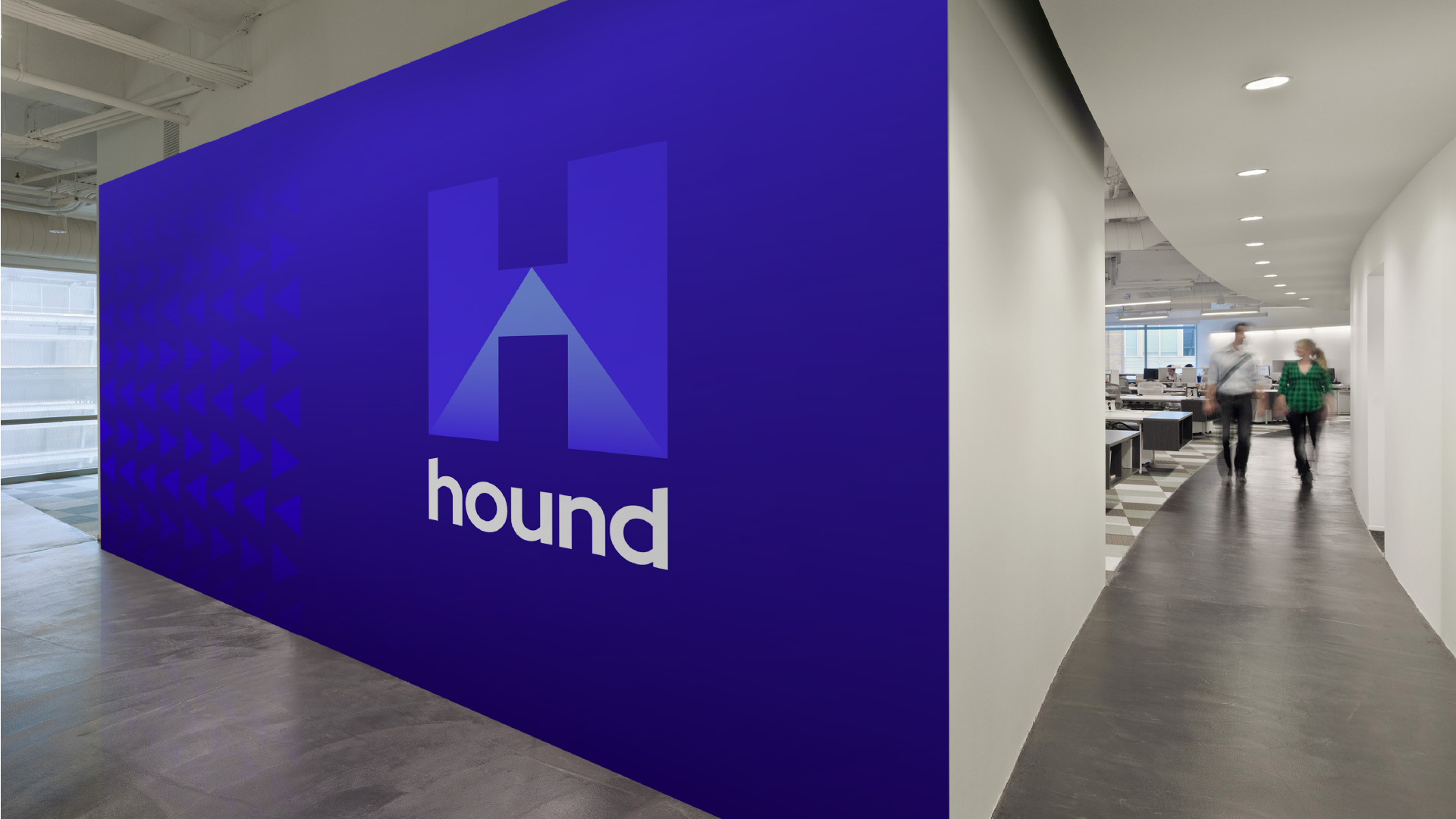
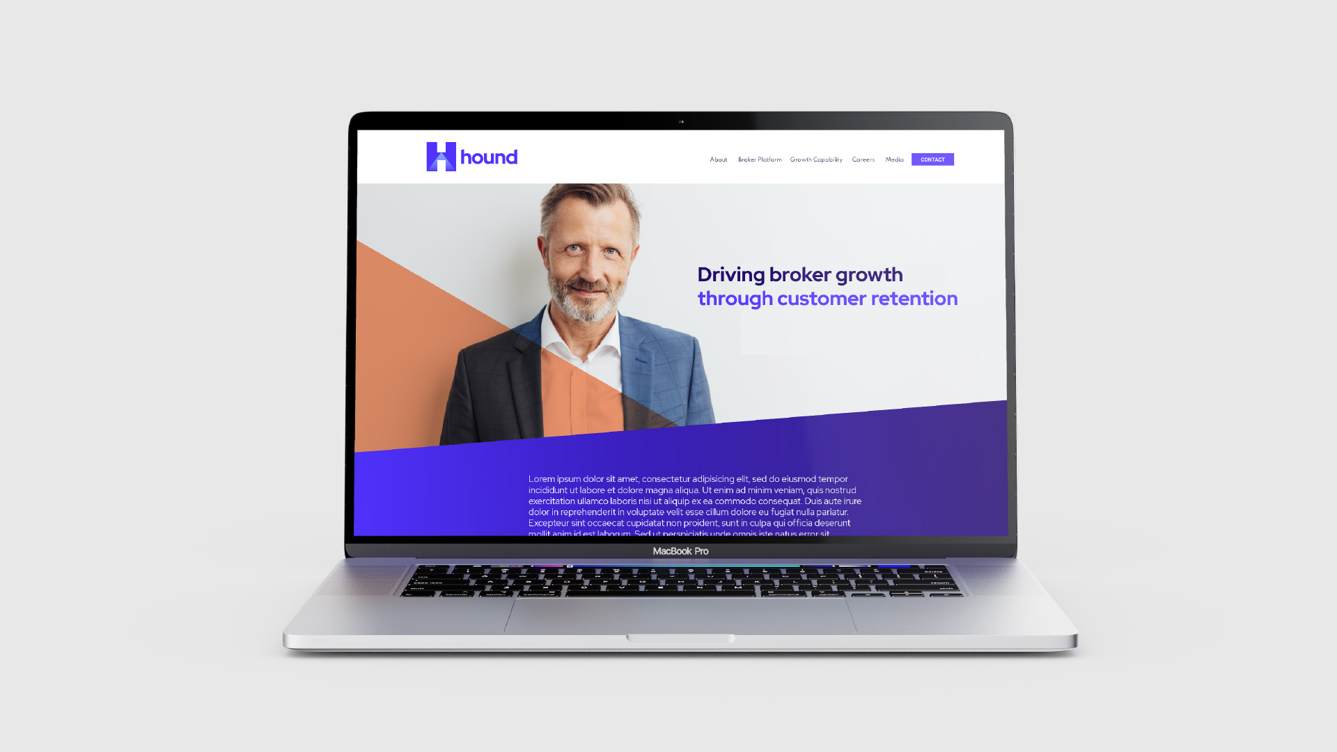
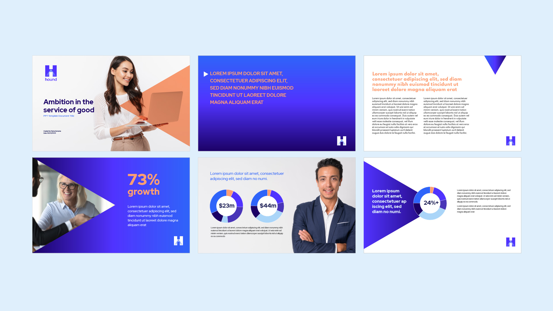
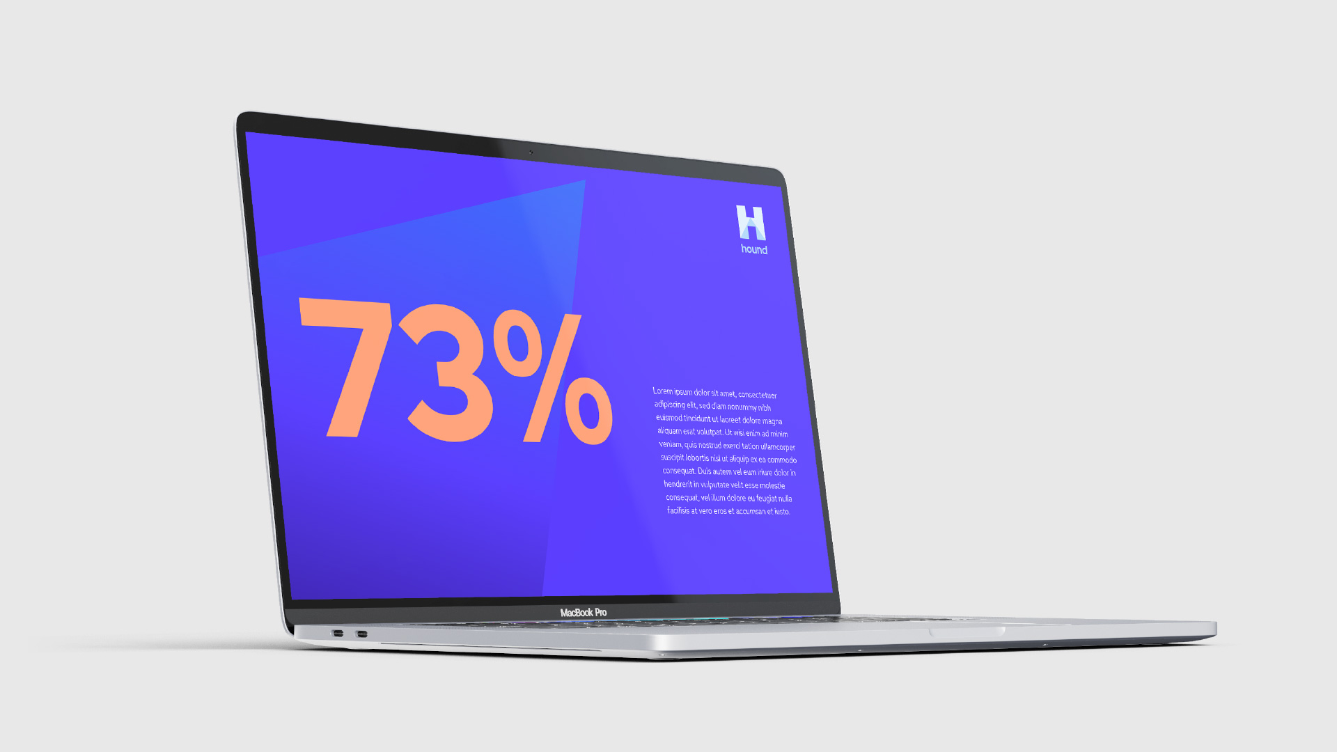
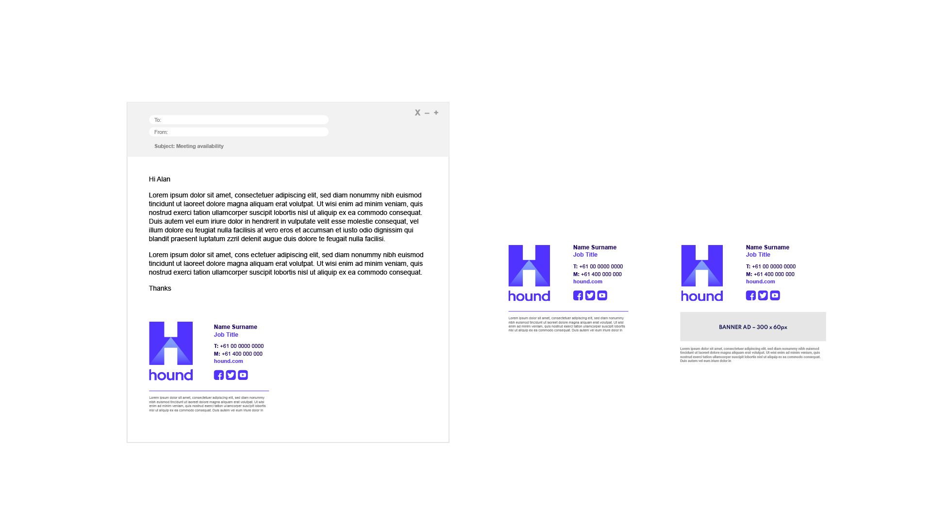
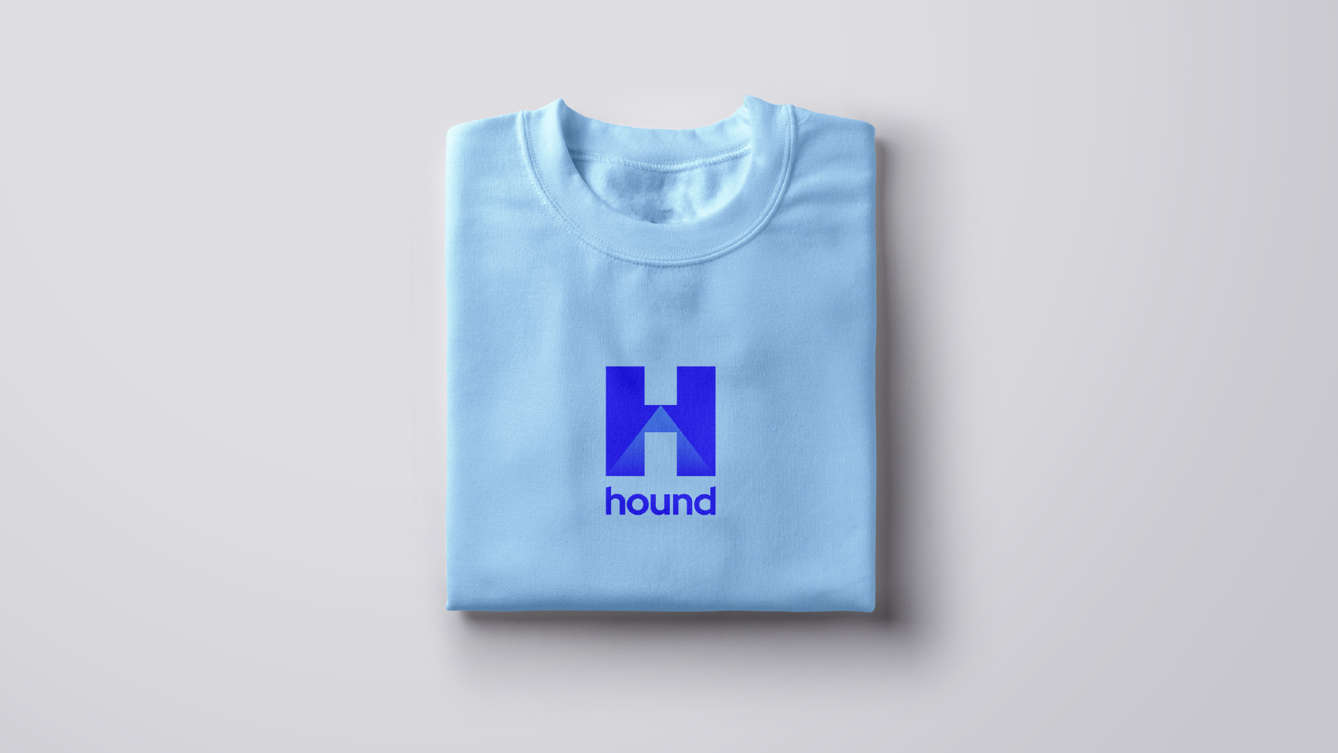
Below are some examples of how our brand comes to life across various printed and digital applications.
Our brand look has been developed with our community in mind. One that reflects our vision and commitment to them and how we want engage.
A modern simple yet confident approach is what we aspire to achieve in all our communications.
Designed with flexibility and structure to comfortably convert from printed documents to engaging fresh digital communications.
The examples shown below demonstrate this flexibility and how brand look can adapt to our audience so we are always communicating with maximum effect.
If you have any questions or seek clarification on developing collateral please speak to the brand creators via the contact form at the bottom of the page.
Approvals
Guideline Usage
Issue of these guidelines, or any part thereof, is for the purpose of informing recipients of graphic standards and does not constitute an authorisation to reproduce any of the marks and elements it relates to.
Approvals
All applications of this Logo and/or any other Logos or graphics provided with these guidelines must be submitted for approval to the Brand Team prior to release or production.
Usage Rights
Only authorised parties may use the graphics in these guidelines. Usage rights will vary between organisations. Please refer to your contract, or contact your Account Manager, to confirm your usage rights.
Asset Usage
Access and usage rights to intellectual property and graphics provided in these guidelines are subject to change. Please check that all imagery is approved for final use and all agreements are in place.